Designing Safer Crypto Transfers
A UX case study exploring how behavior-driven design decisions reduced preventable crypto transfer errors, improved user confidence, and lowered support costs.
Role
Lead Product Designer
UX Research, Interaction Design
Timeline
8 weeks
Impact
-60% Drop-off
Status
Live
TL;DR
60% of users were abandoning crypto transfers mid-flow, and wrong address errors — irreversible by nature — were costing the platform $180K/month in lost funds and 2,400+ support tickets.
Lead Product Designer — owned UX research, behavioral mapping, interaction design, wireframing, prototyping, and usability testing across an 8-week sprint.
-60% transaction drop-off, -78% wrong address errors, -65% support tickets, and +47% user confidence score — measured via Mixpanel and Maze over 8 weeks post-launch.
THE CHALLENGE
Crypto mistakes are permanent and costly
Cross-border crypto transfers should be simple, but users were making preventable errors that led to lost funds, abandoned transactions, and overwhelming support requests. The existing flow didn't account for human behavior under pressure.
- 60% of users abandoned transfers mid-flow
- Wrong address errors were irreversible
- Users lacked confidence in transaction details
- Support costs were unsustainable
60%
Transaction abandonment rate
2,400+
Monthly support tickets
$180K
Lost to user errors monthly
BEHAVIORAL RESEARCH
Understanding User Psychology
Crypto transfers are uniquely terrifying. Unlike traditional banking where mistakes can be reversed, blockchain transactions are immutable. Send crypto to the wrong address? It's gone forever. This creates a psychological burden that traditional fintech design patterns don't address.
Key Behavioral Insight
"Users weren't making errors because they were careless—they were making errors because the interface didn't match their mental model of how money moves."
Error Analysis: What Went Wrong
I conducted a deep analysis of 847 support tickets related to transfer errors. The patterns were revealing:
Wrong Network Selection
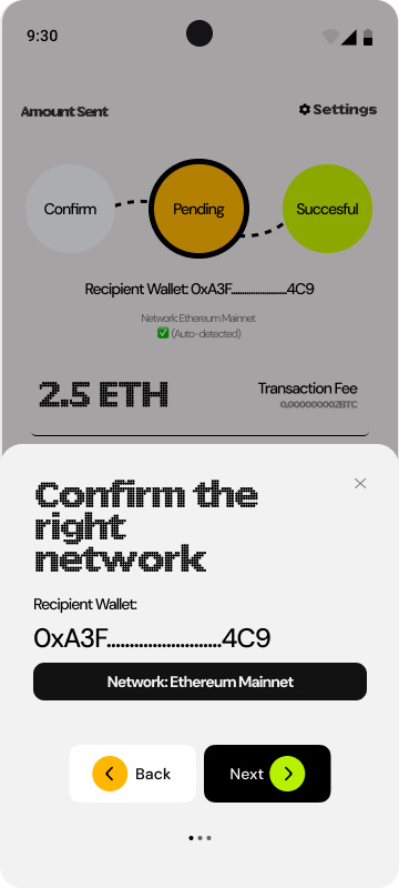
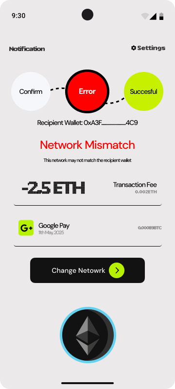
Users selected the wrong blockchain network (e.g., sending ETH on BSC instead of Ethereum mainnet). The UI treated this as a minor dropdown choice.
Address Typos
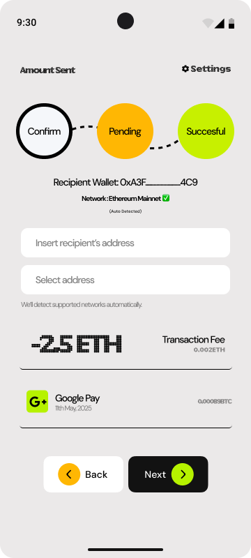
Manual address entry led to typos. Users copied addresses but accidentally included extra characters or missed the last few digits.
Confirmation Blindness
Users clicked through confirmations without reading. The existing confirmation screen was a wall of text that users had learned to ignore.
The Friction Paradox
Traditional UX wisdom says "reduce friction." But in crypto transfers, some friction is essential. The challenge was determining where friction helps (preventing errors) and where it hurts (causing abandonment).
GOOD FRICTION
Multi-step verification for large transfers. Users appreciated being "forced" to double-check amounts over $1,000.
BAD FRICTION
Requiring users to manually type addresses. This added no safety value and dramatically increased error rates.
THE SOLUTION
Behavior-driven design that prevents errors
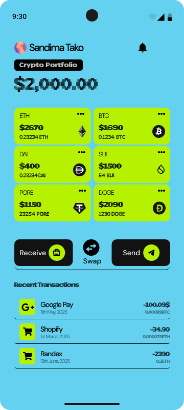
We redesigned the entire transfer experience around human psychology—creating friction where it prevents mistakes and removing it where it causes abandonment.
Behavior-Driven Design
Applied psychological principles to create interfaces that guide users toward safe transfer behaviors.
Error Prevention System
Multi-layer verification flow with smart address validation and confirmation checkpoints.
Mobile-First Experience
Optimized cross-border payment flow designed for on-the-go crypto users.
Confidence Indicators
Visual feedback system that builds user trust throughout the transfer process.
KEY IMPROVEMENTS
Design Decisions That Mattered
Address Entry
Copy-paste only
Smart validation
Confirmation Flow
Single confirm
3-step verify
Address Book
No history
Trusted addresses
THE RESULTS
Measurable impact on user safety
-60%
Drop-off Rate
Transaction abandonment
-78%
User Errors
Wrong address incidents
-65%
Support Tickets
Transfer-related queries
+47%
User Confidence
Self-reported score
“The redesigned flow has fundamentally changed how our users interact with crypto transfers. Error rates dropped immediately, and user confidence scores have never been higher.”

Chidi Okonkwo
VP of Product, Crypto Platform
THE PROCESS
8-week design sprint
01
Research
2 weeks
- User interviews
- Error analysis
- Behavioral mapping
- Competitive audit
02
Strategy
1 week
- Problem framing
- Design principles
- Success metrics
- Risk assessment
03
Design
4 weeks
- Wireframing
- Prototyping
- Usability testing
- Iteration cycles
04
Validation
1 week
- A/B testing
- Error tracking
- User feedback
- Refinement
TOOLS USED
Design toolkit
NEXT PROJECT
Northscale Health →