RENA Tech Street Fashion
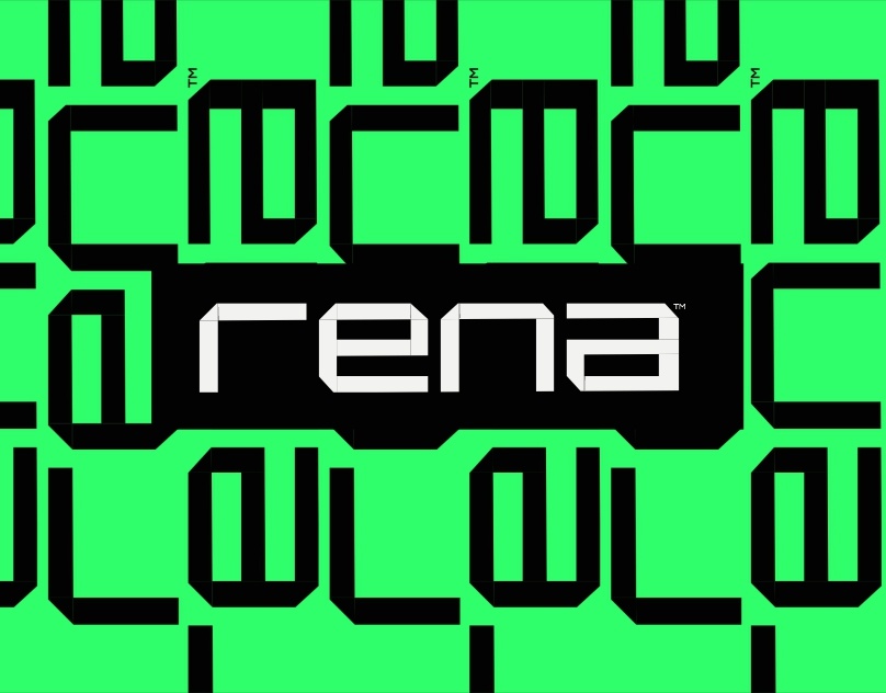
Complete brand identity for a tech-inspired streetwear label, blending urban aesthetics with digital innovation for the Gen-Z market.
Role
Lead Product Designer
Strategy, Visual Identity, Guidelines
Timeline
7 days
Impact
2K+ pre-orders
Status
Launched
TL;DR
A new streetwear label needed a distinct, scalable brand identity to stand out in a $50B+ market and resonate with a tech-savvy Gen-Z audience — with zero existing brand equity.
Lead Product Designer — owned the entire process from competitor research and brand strategy to visual identity, typography system, and a 40+ page guidelines document. Delivered in 7 days.
Brand launched with 2,000+ pre-orders before the official launch date — measured at launch in 2024.
THE CHALLENGE
New brand needed distinct identity in crowded streetwear market
RENA approached me with an ambitious goal: launch a tech-inspired streetwear brand that would resonate with Gen-Z consumers who value both digital innovation and authentic street culture. The challenge was creating a brand identity that felt fresh, disruptive, and memorable in an oversaturated market.
- Differentiate from established streetwear brands
- Appeal to tech-savvy Gen-Z audience
- Bridge the gap between digital and physical fashion
- Create scalable identity system for rapid growth
Gen-Z
Target demographic (18-25)
12 competitors
Analyzed in research phase
$50B+
Global streetwear market
BRAND STRATEGY
Defining the Brand DNA
RENA wasn't just another streetwear brand—it was a statement about the intersection of technology and urban culture. The founders had a vision: clothing that spoke to the generation raised on screens, who saw no distinction between their digital and physical identities.
Brand Positioning Statement
"RENA is for the generation that codes by day and hits the streets by night. We don't follow trends—we engineer them."
Competitive Landscape Analysis
I analyzed 12 competitors across the tech-fashion space, from established players like OFF-WHITE and A-COLD-WALL* to emerging brands like ACRONYM and 1017 ALYX 9SM. The analysis revealed a clear opportunity:
GAP IDENTIFIED
Most tech-inspired brands leaned heavily into dystopian aesthetics. Gen-Z wanted something more optimistic—tech as empowerment, not threat.
OUR ANGLE
Vibrant, energetic colors. Clean digital aesthetics. A brand that felt like the future people actually want to live in.
Target Audience Deep Dive
Through social listening and trend analysis, I developed detailed personas for RENA's core audience:
The Creative Coder (18-22)
Computer science students who attend hackathons and sneaker drops with equal enthusiasm. They value authenticity and hate anything that feels "corporate."
The Digital Native Professional (23-28)
Young tech workers with disposable income. They want to express their identity through fashion but don't want to look like everyone else at the startup.
THE SOLUTION
Built complete brand identity from zero
Conducted competitor analysis, defined brand positioning for Gen-Z tech-fashion crossover, and delivered a comprehensive visual system in just 7 days.
Brand Strategy
Defined brand positioning for Gen-Z tech-fashion crossover market with clear differentiation.
Visual Identity
Created complete color system, logo variations, and visual language that bridges tech and street culture.
Typography System
Custom type pairing that communicates both technical precision and urban edge.
Brand Guidelines
Comprehensive 40+ page guidelines ensuring consistent brand application across all touchpoints.
BRAND ELEMENTS
Visual Identity System
COLOR PALETTE
Neon Green
#2EFF6A
Carbon Black
#0B0B0B
Bone White
#F2F2F0
TYPOGRAPHY
Aa
Orbitron
Display font - Bold, futuristic geometric sans-serif for headlines and logo
Aa
Satoshi
Body font - Clean, modern sans-serif for descriptions and body text
THE RESULTS
Brand launched with massive pre-order success
2K+
Pre-orders
Before official launch
7
Days
From brief to delivery
40+
Pages
Brand guidelines
“Simeon understood our vision instantly. The brand identity he created perfectly captures the intersection of tech culture and street fashion. Our launch exceeded all expectations.”

Emeka Adeyemi
Founder, RENA
THE PROCESS
7-day sprint from brief to launch
01
Research
2 days
- Competitor analysis
- Target audience research
- Trend mapping
- Market positioning
02
Strategy
1 day
- Brand positioning
- Value proposition
- Tone of voice
- Brand architecture
03
Design
3 days
- Logo exploration
- Color palette
- Typography selection
- Visual elements
04
Delivery
1 day
- Brand guidelines
- Asset creation
- File preparation
- Handoff
TOOLS USED
Design toolkit
NEXT PROJECT
Velocity 2.0 →